
A single word may send a reader—or viewer—down the wrong path. On the cover of ALIBIS: SIGMAR POLKE 1963–2010 (Museum of Modern Art, $75), the title appears against a close-up of snakeskin—printed on boards embossed with a scaly texture—framing a photo of the artist as a child manipulating a marionette. In the book’s lead essay, curator Kathy Halbreich proposes that Polke studiously avoided any signature style or medium, “so that his aesthetic method . . . enacted the role of an alibi.” But alibis brings to mind excuses, and the book takes a historically constrained viewpoint—the text is full of references to Germany’s dark past. The marionette and snakeskin suggest something closer to aliases, an artist embracing multiple identities in the pursuit of freedom. And Polke’s work is self-evidently open, experimental, and reveling in possibility. The cover seems to have been inspired by a photo sequence in the show of Polke performing for the camera, stretched out on a floral carpet, his lower parts wrapped in a python skin. Is he sloughing off an old identity or delighting in a new one? We can’t know, but Polke’s extraordinary windows for Zurich’s Grossmünster suggest he had his gaze fixed on the artistic hereafter, not the political heretofore.
In 1968, Polke’s mordant wit found an inviting target in echt-Minimalist sculptor Carl Andre. Lampooning what he saw as the pompous dreariness of much Minimalist art, Polke took a swatch of printed fabric, which reproduces a square grid of Dutch ceramic tiles, and titled it Carl Andre in Delft. A 224-page plate section precedes the title page of Dia Art Foundation’s CARL ANDRE: SCULPTURE AS PLACE, 1958–2010 (Yale, $65), by Philippe Vergne and Yasmil Raymond. A slog through more than a hundred pages of installation views seems to reinforce Polke’s point, the reproductions on uncoated paper being anhedonically gray, as if xeroxed from old issues of Artforum. But the slog soon becomes a meander as color is introduced and, about two-thirds in, we encounter Andre’s language pieces, mainly from the ’60s and early ’70s. Another dimension of the artist is revealed: a rigorous maker of “visual texts,” that is, a poet, which was Andre’s earliest creative vocation. A fine selection of essays alternates between studies of Andre’s sculpture and of his textual works, examined thoughtfully by Vincent Katz, Marjorie Perloff, and Christophe Cherix. Tellingly, the austere blue cloth cover does not feature one of Andre’s well-known sculptures but rather his programmatic poem “preface to my work itself” (1963):
in, is, my, of, art, the, into,
made, same, this, work, parts,
piled, piles, broken, pieces,
stacks, clastic, stacked,
identical, interchangeable
EDMUND DE WAAL (Phaidon, $100), a pricey survey of work by a “potter who writes,” as he styles himself, raises the rude question: Would we be interested in the work of a locally esteemed potter if he were not also a best-selling author?De Waal relates that when he began writing criticism for crafts reviews, there was “a breaking of the silences around who is allowed to say what. The orthodoxies challenged.” About ceramics? Batten down the teapot, honey, tempest brewing. The book’s precious design features a debossed cloth cover, tasteful gray-brown pages bracketing each section, and contributions by smitten authors, Colm Tóibín and Peter Carey among them, printed on translucent vellum-like paper in blue type. Carl Andre is invoked here to supply a Minimalist lineage for de Waal’s arrangements of small, cylindrical pots, often installed on shelves, mantels, bookcases, and the corbels of stately British homes. As de Waal has lately become an art star, he must now figure out how to fill vast, empty galleries with lots of pots: He commissions imposing white or black wall-mounted shelves, resembling oversize letterpress-printing-type cases, which suggest that Agnes Martin somehow had been let loose in Louise Nevelson’s studio.
The charcoal-gray covers and endpapers of Bethany Johns’s restrained design for LEE BONTECOU: DRAWN WORLDS (Menil Collection/Yale, $50) seem appropriate to drawings—surveyed here for the first time—whose media often include graphite and soot, as if they had materialized in modernism’s exhaust. The book’s printing, on heavy cream-colored paper stock, captures the drawings’ virtuosic and delicate shading. Johns may have been inspired by the book’s eight fascinating reproductions of spreads from a sketchbook, repurposed from an accounting ledger, that Bontecou filled between 1957 and 1960. Plates are sequenced by formal affinities rather than chronology, reinforcing one’s impression of an organic, spiraling oeuvre, forever returning to key motifs. The drawings’ Surrealist parentage is on display, but there is also a retro look of jet-engine fairings, intake manifolds, early-’60s auto tail fins, and other space-age paraphernalia (Bontecou’s father and uncle worked for Grumman). Eyes, cavities, orifices, and black holes abound, staring with blank menace, and a sequence of striated skeletal figures seems to enact the successive stages of a scream.
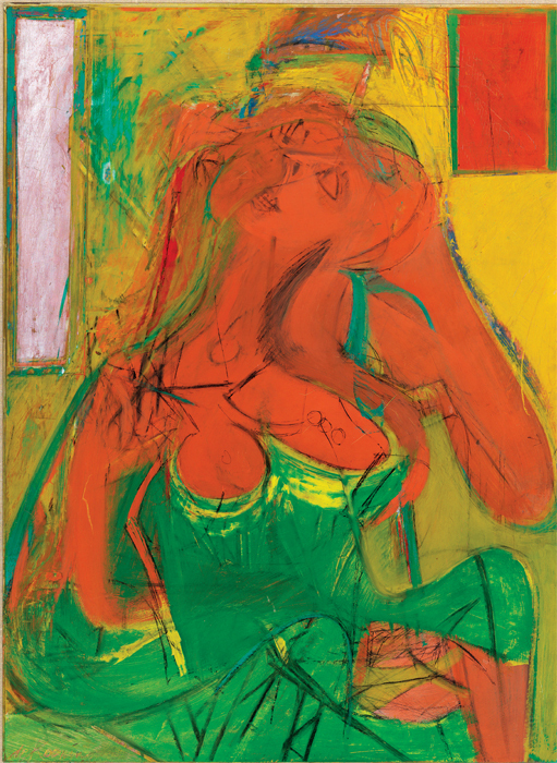
The traditional monograph seems an endangered species these days; one that gets everything right is rare enough to qualify as an art-publishing event. A WAY OF LIVING: THE ART OF WILLEM DE KOONING (Phaidon, $100) is an evenhanded, authoritative, and critically informed account of the great painter’s achievement. Judith Zilczer, drawing on decades of research as a curator at the Hirshhorn Museum, has a simple but powerful thesis: “De Kooning’s identification of painting with life itself [was] the well-spring of his creativity throughout his career.” De Kooning is allowed to speak for himself in quotes that convey his critical intelligence and wit; of himself as a young painter, he said, “I was so modest then that I was vain.” The text is illuminating and readable—Zilczer is generous to all sides in relating the controversy over the late works—and the reproductions of the art are splendid. A minor misfire is an acidy aqua cloth cover that clashes with the serene de Kooning blue reproduced on the book’s sturdy slipcase.
Plug a word in the Visual Thesaurus, an app I occasionally use (employ, turn to, consult), and a web of related meanings bounces onto the screen. Mel Bochner does something similar the old-fashioned (traditional, time-tested, old-school) way: He draws and paints strings of words in a series of paintings begun in 2002, when he happened upon an updated Roget’s Thesaurus. MEL BOCHNER: STRONG LANGUAGE (Jewish Museum/Yale, $45) surveys these works and also collects the early notations and word drawings, which employ text and simple forms to explore Wittgensteinian conundrums (or make witty “portraits” of contemporaries such as Sol LeWitt and Eva Hesse). The painting series “If the Color Changes,” 1997–2000, impressively extends that conceptual engagement, but the recent thesaurus paintings remain oddly inert and hermetic, despite splashy brushwork and jarring colors, relying on a Jasper Johns–like dissonance between painting and language, with nods to Ed Ruscha and Christopher Wool. More effective is the banner, reproduced on a spread, made by Bochner for the entablature over the portico of Munich’s Haus der Kunst, the city’s outstanding example of Nazi architecture. In monumental yellow type, it reads: KIBBITZER, KVETCHER, NUDNICK, NEBBISH, NUDZAH, MESHUGENER, ALTER KOCKER, PISHER, PLOSHER, PLATKE-MACHER. Its title? The Joys of Yiddish.
A photo in AMÉRICA LATINA, 1960–2013: PHOTOGRAPHS (Fondation Cartier/Thames & Hudson, $45) shows Francis Alÿs pulling a little yellow “magnetized collector” on wheels along a street in Mexico City; the device has gradually accumulated a coat of metallic grit. Cameras in Latin America seem to attract words similarly. This book is alive with them: graffiti, revolutionary slogans, ads, and posters, as well as writings by the artists on or accompanying the photos. The focus is relentlessly sociopolitical: The lead essay is by a historian of Latin America, Olivier Compagnon, rather than a photography specialist. More than seventy artists or groups are represented, some well known—Brazilian video pioneer Anna Bella Geiger, and Luis Camnitzer, who also contributes an illuminating essay—and many who will be discoveries for nonspecialists. Designer Olivier Andreotti favors punchy graphics, including a color-coded scheme keyed to themes that organize the book—“Territory” (dark blue), “The City” (red), “Informing / Resisting” (yellow), “Memory and Identity” (light blue), and “Revueltas” (green)—and a clever binding that allows spreads to lie flat.
Accompanying a Met exhibition that’s also traveling to Paris, THE PASSIONS OF JEAN-BAPTISTE CARPEAUX (Metropolitan Museum of Art/Yale, $65), with its splendid photography, might have represented a kind of ideal exhibition. Carpeaux was famous for his sculpted smiles, but his artistic career was launched by an anguished grimace. The latter is portrayed in Ugolino and His Sons, conceived in the late 1850s. Practically gnawing at his fingers from hunger, the cruel tyrant, famously portrayed in Dante’s Inferno, is caught in a pose of unbearable, compressed tension, the moment before a moral explosion—he will eat his children. Ugolino has a sunny counterpart made for Garnier’s Opéra, The Dance, in 1868. In it, a gaily laughing “Genius of the Dance” rises from entwined limbs of a ring of dancers, embodying an eruption of erotic joy. These great sculptural groups are together only in the book, where they might have defined a narrative arc for Carpeaux’s many-sided career, from Prix de Rome prodigy to an early death in 1875, when The Dance, despite having been fiercely criticized for its nonclassical nudity, became a memorial to the sculptor. Instead, the book deploys essays disjointedly alternating between studies of period and genre, with a chronology inserted, oddly, at the front of the book, as if to compensate for a lack of narrative clarity.
Respite from the unceasing chatter by and about pictures is offered by ZOE LEONARD: AVAILABLE LIGHT (Dancing Foxes Press/Ridinghouse, $45), which documents the artist’s camera-obscura installations in Cologne, London, Venice, and Marfa, Texas. Like Alice on the far side of the looking glass, we are in an upside-down, distorted world curiously similar to our own. The book features an informative introduction by Diedrich Diederichsen and texts by Suzanne Hudson and Glenn Ligon, but it is the silence of the images that impresses. Of course, what is most eerie about seeing camera-obscura projections in person is the shadowy play of life outside, projected on the wall in real time—like the almost-imperceptible softening of sunlight reflected by a wall, when a cloud, perhaps, moves across the sun, in Leonard’s impressive recent Whitney Biennial installation. Such nuances cannot be captured in print—one more reason why electronic publications will be the future of the art book.
Christopher Lyon is an art-book publisher and writer based in Brooklyn.


